
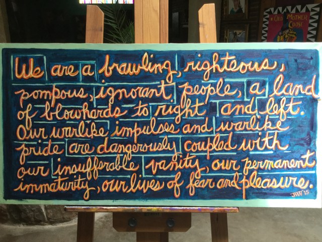
JMN2015 We Are, Oil on canvas, 24 x 48 in. (c) James Mansfield Nichols. All rights reserved.
In my twenties I fantasized an artistic project called “The Painted Word” — standing language on its head by meticulously brushing it on canvas. (I didn’t know until later that Tom Wolfe had used the phrase for the title of his 1975 book.) In my notion, any stretch of discourse, even randomly excerpted, would morph into pregnant glyphic transcendence. The project would be a piquantly regressive, anti-Gutenbergian dive into artisanal messaging with McLuhanesque undertones. Neo-medieval handmade speech. Or something.
My high-flown conceptualizing had no formal art training behind it. It was as presumptuous then as it is now.
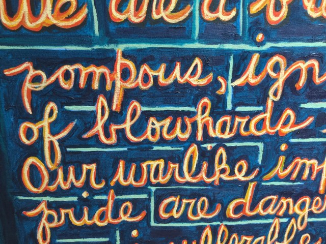
JMN2015 We Are, Oil on canvas, 24 x 48 in. (c) James Mansfield Nichols. All rights reserved. (detail 1)
I was snapping billboards and signs with my Polaroid camera at the time: “We Custom Crack Your Nuts” (a pecan processor); “Your Hole Is Our Goal” (an oilfield services company); “All Guns Must Be Chambers Open” (sign in a Texas bar). The spray-painted verbiage on boxcars trundling past level-crossings with coal for the power plant had my attention. Also, classical Arabic, my major, had a rich tradition of incorporating its graceful script into murals and decoration.
Nicking supplies from my dad’s studio, I dashed off a proof of concept on canvas board using a sentence I had pulled arbitrarily from a New Yorker article: “This cannot be what Miss Wells had in mind.” Out of context it had a little kick of mystery to it and just the prissy resonance I admired in New Yorker style. It could even be a trifle naughty.
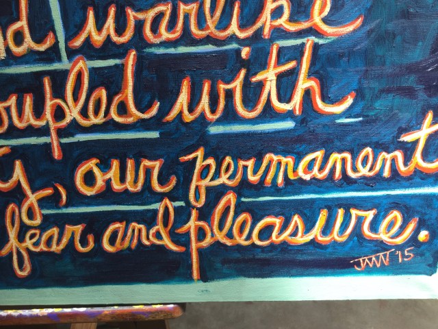
JMN2015 We Are, Oil on canvas, 24 x 48 in. (c) James Mansfield Nichols. All rights reserved. (detail 2)
The exercise acquainted me with the unbearable tedium of painting printed words convincingly. My little experiment degenerated into a riot of freehanding with dribbles and meanderings that left it having more in common with doodles than with typography.
I wasn’t entirely displeased with how “Miss Wells” had turned out. To my self-indulgent eye, what it lacked in deft execution it gained in wooly vigor. I wasn’t focused or mature enough, however, to put serious effort behind my conceit. I drifted in other directions.
[My painting in this post is a quotation from Robert Olmstead, “War and Baked Beans,” NYTimes, 2013.]
(Copyright 2018 James Mansfield Nichols. All rights reserved.)

Great concept for a series – but yes, there’d be some patience required (speaking as one who doesn’t have any for hand lettering).
LikeLiked by 1 person
I noticed immediately the distinctive lettering of your wonderful drawings’ narratives when I started looking. Interestingly spikey. From what you say I take it that it’s a font. Agreeing with you, I think lettering and cursive writing have great expressive potential, but I have trouble mustering the discipline to bring something to fruition. I imagine just drawing from scratch a template of crude fat letters that would lend themselves to being transferred to canvas as painlessly as possible and brushed in. I’m floundering badly at adding the prescribed verbiage to my current little project — on the verge of leaving it mute.
LikeLiked by 1 person
Yes, I use a font. Hand lettering is on the list of things to tackle … eventually – maybe. (I find sizing and spacing issues alone to be mind boggling.) I get the feeling that if you do manage to figure out an approach to text, some fine things will come out. Edward Goss is an abstract artist who has a nice way with incorporating letters/ writing – https://www.instagram.com/edwardgoss_/?hl=en
LikeLiked by 1 person
Thank you, and thanks for the link. I’ll definitely check out Edward Goss. Much appreciated.
LikeLiked by 1 person