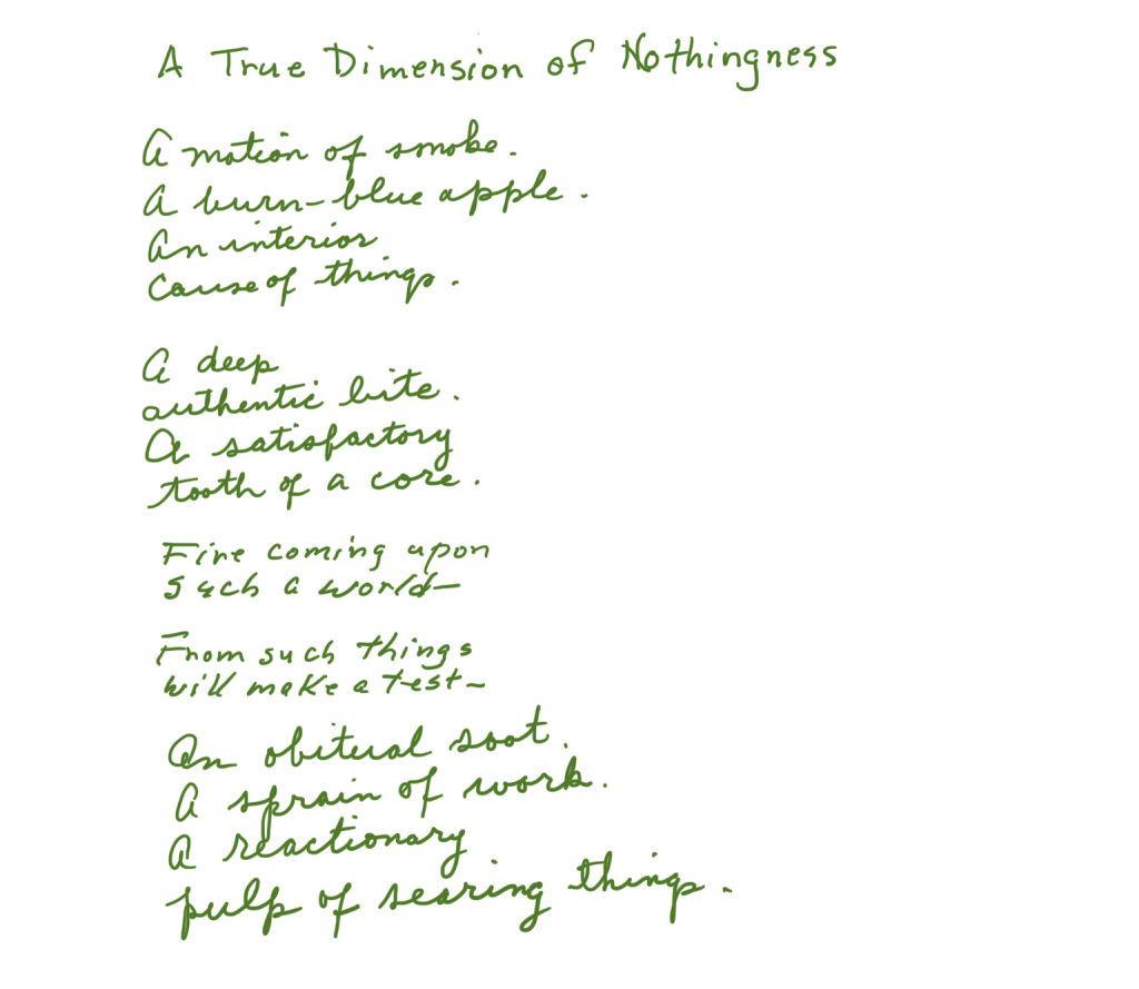
It’s possible to attribute eccentric form to lineated discourse that’s unscannable. Discard capitalization, italics and punctuation. What’s left is line. Lines have their element, like a fish its water, in white space aka page space. The writer commandeers spacing as a tool with which to impinge upon the reader’s faculty for apprehending utterance.
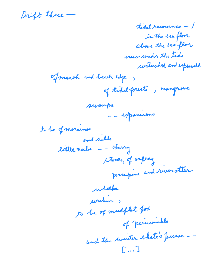
The manner in which words occupy their space is a force multiplier. Features such as indentation, word and letter hyper-gapping, and geminative CRLFs arguably boost signal.
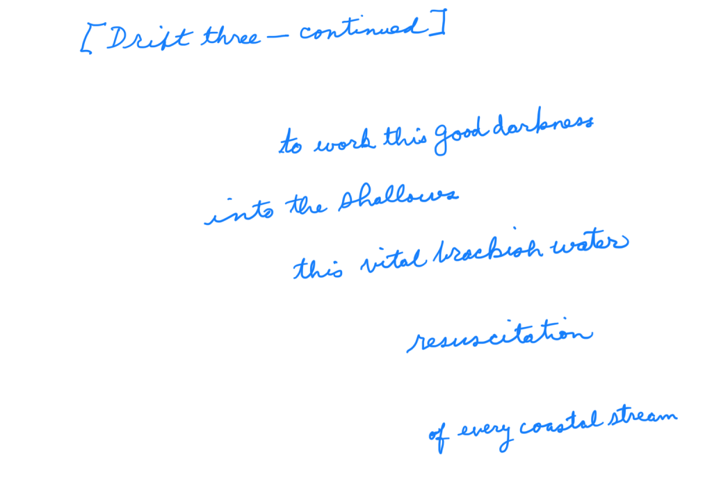
One infers a dynamic of phrasing, a chafing of lexicon, a flexing of syntax conjured in the writer’s mind, to which conformation the writer constrains the spill of printed text over, across, down and around the page. All aspects of two dimensions figure, including the upside down.
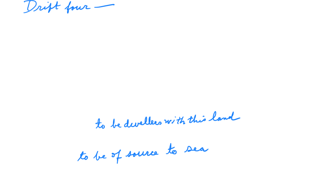
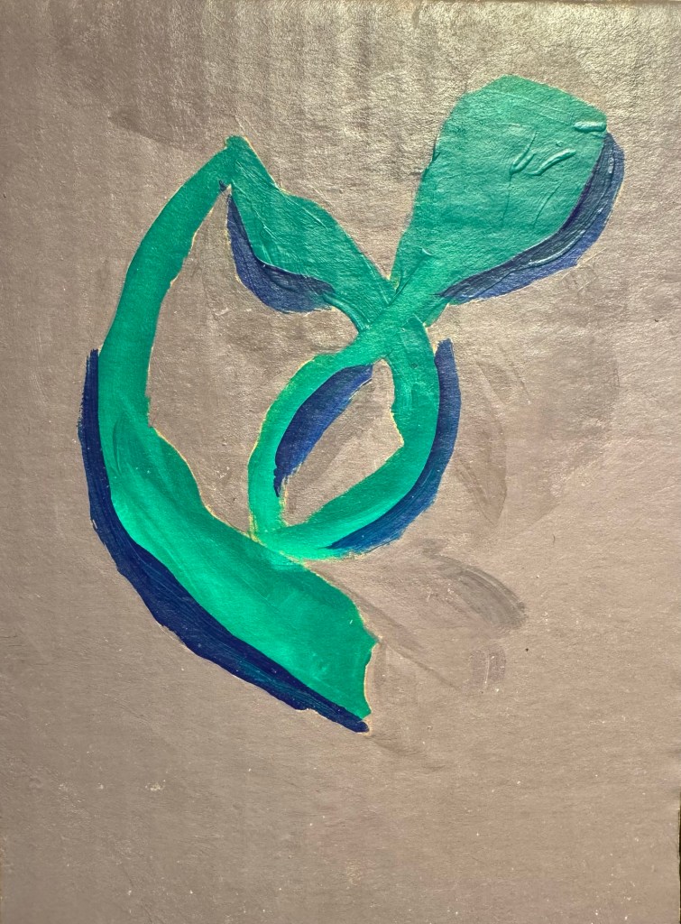
Bespoke word placement on the typeset plane groups, isolates, steers, focuses, creates cleavage, clash, attraction of reference and connotation. The text is more than the sum of its particles and lexemes; read but also viewed. To cite such text one best photographs it, or else sketches it cursively. It’s an uttered image, a laidout revelation, a verbal spectacle.
Aggressive space allocation confers an authorial bossiness on the text. One infers that the writer is at special pains to manage the flow of thought and emotion sought to be conveyed.

One infers that the writer has plumbed private intuition in order to instantiate a one-off, typographical form factor suited for optimal expression of a distinctly personal, or universally resonant, noteworthy, communicable psychic event.
(c) 2024 JMN — EthicalDative. All rights reserved
