
Amanda Williams, “She May Well Have Invented Herself,” 2024, a painting with Williams’s Innovation Blue pigment, Alabama red clay gesso on wood panel[.] Credit… Amanda Williams; via Casey Kaplan, New York; Photo by Dan Bradica Studio [New York Times caption and illustration]
“There is something anthropomorphic about this work… I didn’t force it. That’s what made it powerful.”
(Amanda Williams)
In her studio, Williams experimented with her Prussian blue, layering, diluting and pouring the paint, letting it crack, pool and bleed across the canvas. The apparition on the first canvas was the only full human form to materialize… The rest of the resulting paintings — such as the evocatively titled “Historical Elisions, Gap for Blue” and “Blue Smells Like We Been Outside” — produced their own ghosts, neither fully figurative nor entirely abstract. Some suggest torsos, while others allude to landscapes, rivers, or veins.

[… A] wall installation titled “Run Together and Look Ugly After the First Rain,” 2025; center, “I Don’t Sing If I Don’t Mean It,” 2025; right, “Blue Smells Like We Been Outside,” 2025. Letting Prussian blue crack, pool and bleed across the canvas created apparitions that suggest torsos, landscapes or rivers. Credit… Elias Williams for The New York Times. [New York Times caption and illustration]
The blue originated in the workshop of George Washington Carver, the Tuskegee food scientist known mainly for his research on peanuts. Carver was an amateur painter who developed and patented his own pigments, including a Prussian blue, from the Alabama soil Black farmers worked at the turn of the 20th century.
Williams discovered in her research that Carver registered a patent in 1927 which described refining red clay soil into paint and dye.
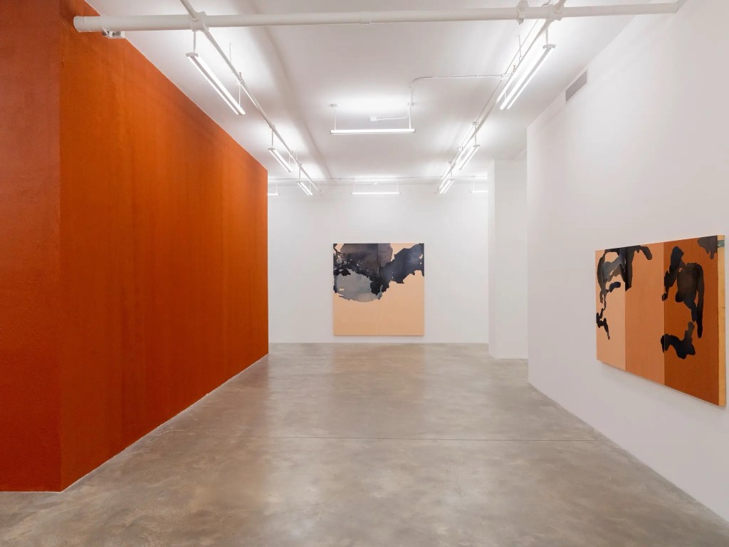
Her works seem to evoke a topography of water and land. Center: “And My Arms Thrown Wide in It, As if for Flight,” 2025. Right: “The Dream Is the Truth. Then You Act and Do Things Accordingly,” feels spectral, 2025. Credit… Elias Williams for The New York Times. [New York Times caption and illustration]
Williams, a Cornell-trained architect, has a deep understanding of color… Williams uses color to alchemize fraught histories into expressions of joy and resilience… For her 2015 project “Color(ed) Theory,” Williams coated eight homes scheduled for demolition on Chicago’s South Side in bold colors — “Currency Exchange yellow,” “Flamin’ Hot orange,” “Crown Royal purple” — referring to consumer products associated with Black life in America… “Amanda understands color tactically, strategically, and historically,” said Michelle Kuo, the chief curator at large and publisher at MoMA. “She’s not just using it for its visual impact, but to map out ideas of place, memory and Black culture. That really is her superpower.”

A wall installation, “Run Together and Look Ugly After the First Rain.” Credit…Elias Williams for The New York Times. [New York Times caption and illustration]
“I want to make sure that the work… stands on its own… It doesn’t have to just carry the baggage of history.”
(Amanda Williams)
(Elly Fishman, “With 100 Pounds of Blue Pigment, an Artist Conjures Spirits of the Past,” New York Times, 3-15-25)
(c) 2025 JMN — EthicalDative. All rights reserved

Such interesting works – I particularly like the last stunning blue piece. Thanks for the post Jim!
LikeLiked by 1 person
Cheers, Sue!
LikeLike
Absolutely striking work. Thank you so much for introducing me to this artist.
LikeLiked by 2 people
You’re very welcome. Glad you like her work too. Thanks for your attention to my blog, Kim. Best wishes. — Jim
LikeLike